Understanding Dashboard Sync Time
0.5 min read
|The data displayed in the Outbound Productivity Dashboard and future dashboards originates in your 3PL Warehouse Manager database and travels through a data pipeline into an analytical database optimized for dashboards and reports. This movement of data through the pipeline adds some delay to the data due to the time it takes to sync.
To optimize the dashboard performance, we use the freshest data when available and one-hour delayed data when that is sufficient for the visual.
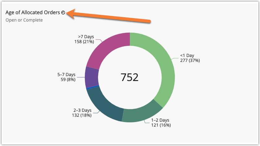
Dashboard visuals with the “◴” symbol after the title indicate a one-hour sync time, or latency, of the data displayed in the visual.

While some dashboard visuals require near real-time latency to show the most current data available (which typically has a delay of 5 to 15 minutes), hourly and historical data visuals sync with a one-hour delay (indicated with a “◴” symbol).
